overview
overview
Domus is a growing home goods and skincare brand built on the premise of providing intentional and well-made items. The brand at its core sells goods, however we also wanted to realize a vision that inspired a way of living that is patient, considered and intentional—that the products Domus creates are products but also more broadly are tools used to support one in living a more considered lifestyle.
Domus is a growing home goods and skincare brand built on the premise of providing intentional and well-made items. The brand at its core sells goods, however we also wanted to realize a vision that inspired a way of living that is patient, considered and intentional—that the products Domus creates are products but also more broadly are tools used to support one in living a more considered lifestyle.

References
References
Given that the brand idea for Domus is a product line rooted in craft, communicating “craft” as a part of the brand visual language felt necessary. To communicate this, we drew upon historical references of embroidered pattern work, textiles, and hand-made making.
Given that the brand idea for Domus is a product line rooted in craft, communicating “craft” as a part of the brand visual language felt necessary. To communicate this, we drew upon historical references of embroidered pattern work, textiles, and hand-made making.


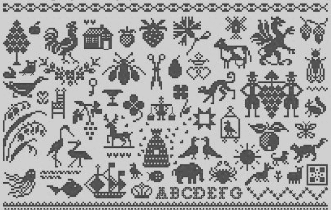
Embroidered patterns and letterforms presented an interesting point of inspiration for the brand visual language. However, after some further research I stumbled across punchcards that are used for machine knitting application.
Embroidered patterns and letterforms presented an interesting point of inspiration for the brand visual language. However, after some further research I stumbled across punchcards that are used for machine knitting application.


The structure that is present in the gridded matrixes of these punchcards conveyed a sense of craft and beauty that pointed to these historical traditions, yet still felt contemporary—a necessary balance in presenting Domus with a visual language that was nostalgically informed yet had a contemporary edge to it.
The structure that is present in the gridded matrixes of these punchcards conveyed a sense of craft and beauty that pointed to these historical traditions, yet still felt contemporary—a necessary balance in presenting Domus with a visual language that was nostalgically informed yet had a contemporary edge to it.
Illustration system
Illustration system
Domus plans to offer a wide array of different products. The planned product categories include skincare, household, hand + body, as well as fragrances.
Domus plans to offer a wide array of different products. The planned product categories include skincare, household, hand + body, as well as fragrances.

Given this wide range of products, a system needed to be devised that would be cohesive and flexible enough to accommodate differences in products and their compositions. With that, I thought about using a modular illustration system that could be used to differentiate between each type of product category. The modularity was paramount as it could then be used across variant lockup sizes and scales.
Given this wide range of products, a system needed to be devised that would be cohesive and flexible enough to accommodate differences in products and their compositions. With that, I thought about using a modular illustration system that could be used to differentiate between each type of product category. The modularity was paramount as it could then be used across variant lockup sizes and scales.

wordmark
wordmark
The model for the wordmark was the italic weight of Tuplet by Jakob Fangmeier. The italic forms nodded towards a historical sense of elegance, whilst the large sharp serifs and relatively hight amount of contrast added a sense of edge that struck the right balance between historical and contemporary we were going for.
The model for the wordmark was the italic weight of Tuplet by Jakob Fangmeier. The italic forms nodded towards a historical sense of elegance, whilst the large sharp serifs and relatively hight amount of contrast added a sense of edge that struck the right balance between historical and contemporary we were going for.



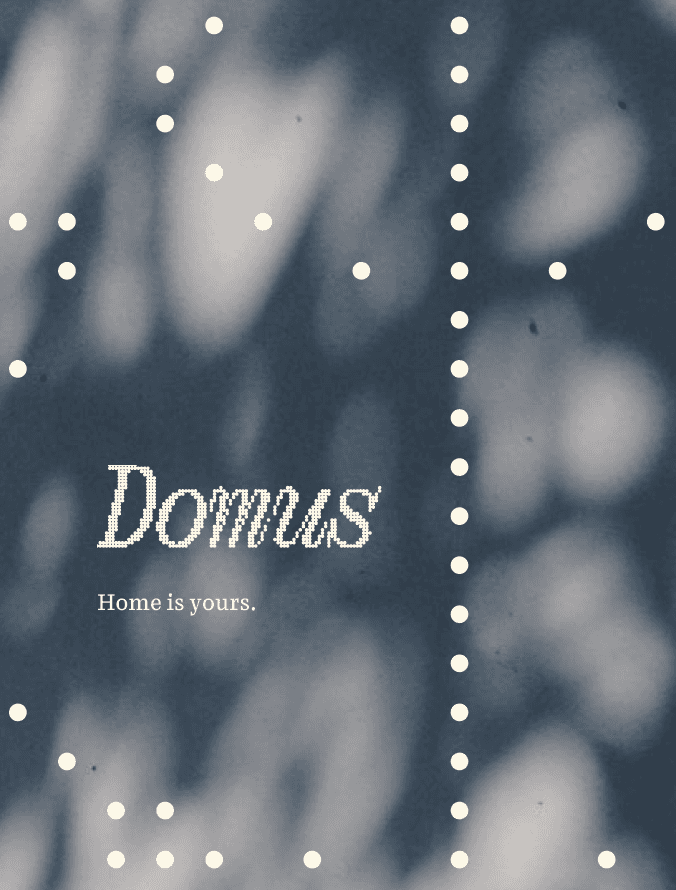
To mesh the mark more cohesively with the matrix visual language we had developed, I made a simple AI tool that allowed me to add the punchcard matrix effect to the mark.
To mesh the mark more cohesively with the matrix visual language we had developed, I made a simple AI tool that allowed me to add the punchcard matrix effect to the mark.
symbol
symbol
The snail motif quickly became an exciting further development of the brand. Ever conscious of wanting to preserve a sense of slowness and rootedness to the brand Ali—the founder—thought it would be appropriate to consider a brand mascot. As Domus is a brand that provides products that accompany people within their homes ideally the mascot would also relate to the idea of a home. After further brainstorming, a snail came up in conversation as it it both literally travels by ground, but also it carries its “home on its back”. The formal gestures of the snail are also meant to reflect and relate to the Domus wordmark in subtle ways.
The snail motif quickly became an exciting further development of the brand. Ever conscious of wanting to preserve a sense of slowness and rootedness to the brand Ali—the founder—thought it would be appropriate to consider a brand mascot. As Domus is a brand that provides products that accompany people within their homes ideally the mascot would also relate to the idea of a home. After further brainstorming, a snail came up in conversation as it it both literally travels by ground, but also it carries its “home on its back”. The formal gestures of the snail are also meant to reflect and relate to the Domus wordmark in subtle ways.


brand typography
brand typography
When considering how to weave the inspirations of embroidered artwork with a contemporary feel, Morgane Vantorre’s typeface “Heline” felt like a seamless fit for the brand. Similar to Tuplet, the brand typeface features a contemporary serif design that echos some of the features of Frangmeier’s Tuplet—bracketed serifs with unique angular exit and entry strokes. Additionally, the typeface features a bitmap version that is inspired by embroidered designs in of itself.
When considering how to weave the inspirations of embroidered artwork with a contemporary feel, Morgane Vantorre’s typeface “Heline” felt like a seamless fit for the brand. Similar to Tuplet, the brand typeface features a contemporary serif design that echos some of the features of Frangmeier’s Tuplet—bracketed serifs with unique angular exit and entry strokes. Additionally, the typeface features a bitmap version that is inspired by embroidered designs in of itself.


packaging application
packaging application
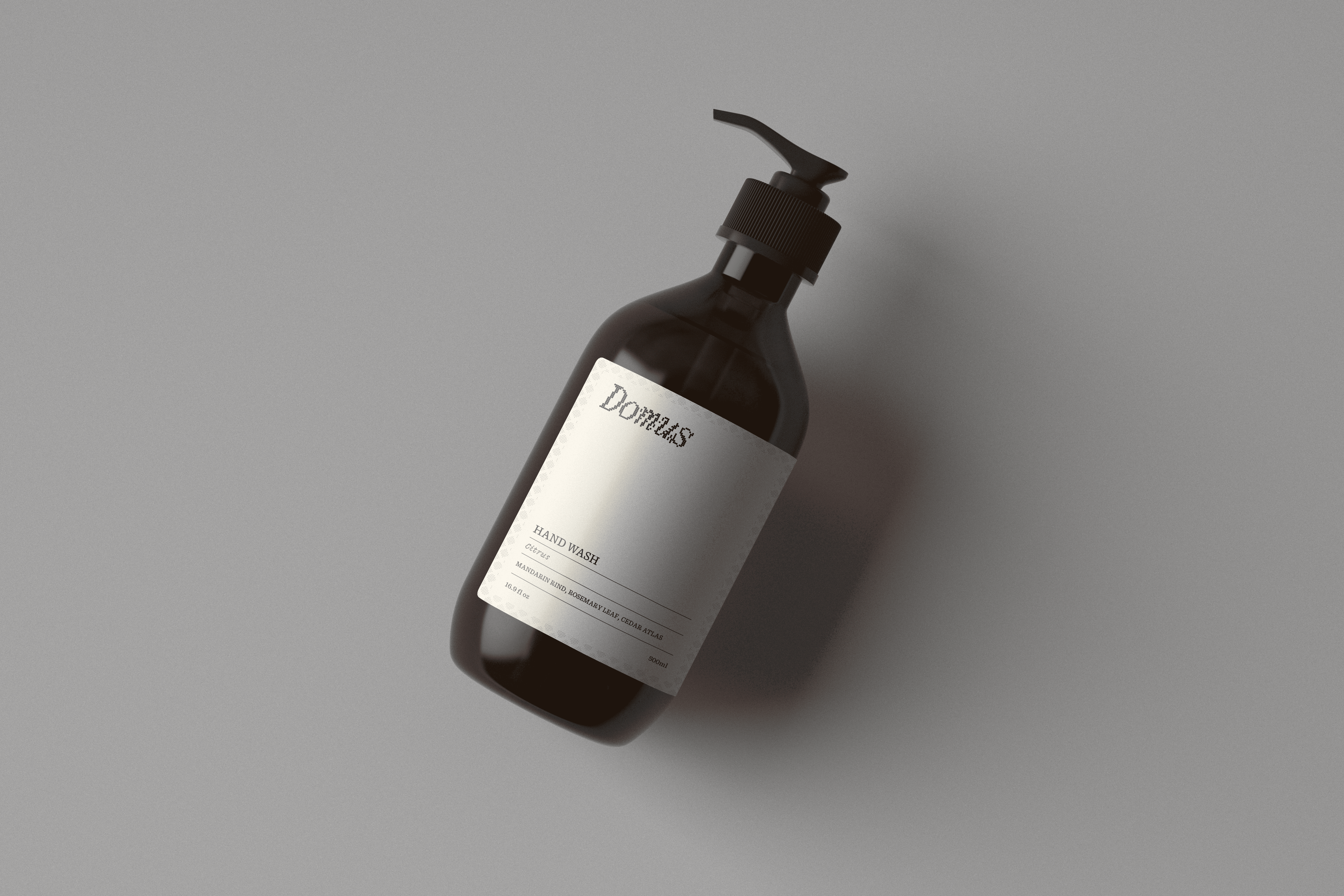
The brand system shown in various packaging formats.
The brand system shown in various packaging formats.


